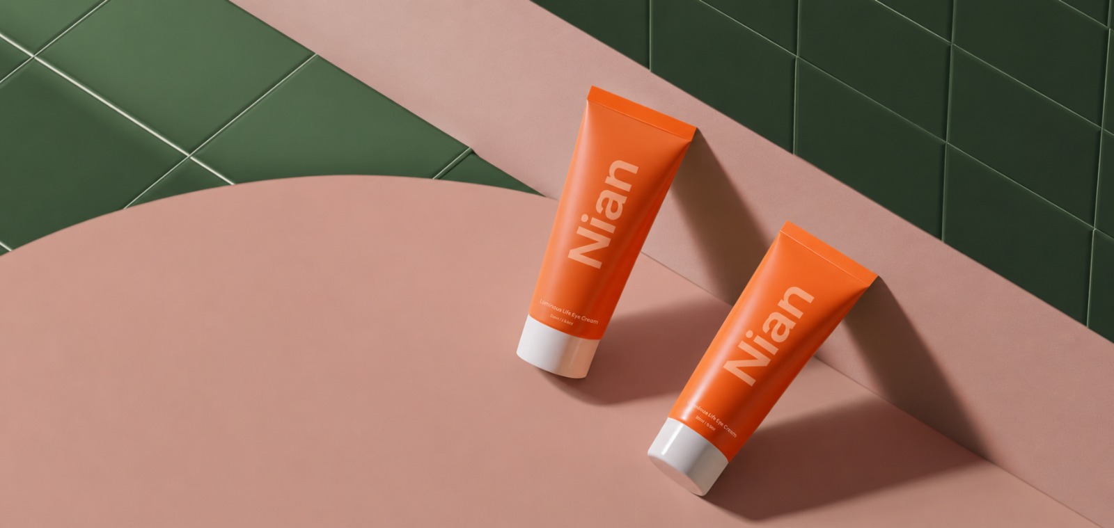

Nian Pharma's line-up covers WHO-GMP-certified pharmaceuticals, health formulations, and active ingredients, and none of it stays local. Customers well beyond India end up using these products. The web application behind it all runs on Next.js and Node.js. Fast to load, built to rank, and solid enough to meet the compliance bar this kind of work demands.
Visit WebsiteIndustries
Ecommerce
Client Location
India
Key Technologies
Next.js Node.js
Client Background
Nian Pharma makes WHO-GMP certified pharmaceuticals, health formulations, and active pharmaceutical ingredients. Their products don't stay in one country either. They ship out to markets across the globe.
That kind of reach comes with a problem, though. The old website wasn't built for a brand this size. It couldn't really show off the full product catalog, the manufacturing side of things, or the certification paperwork that buyers and regulators ask for.
There was no proper space for distributors to work from either. So Nian Pharma came to us wanting something better, a site that could actually carry the weight of the brand.
Kushel Digi Solutions built the new site on Next.js, with speed and search visibility as the starting point rather than an afterthought. Every page got shaped around how someone actually uses it, whether that's a distributor checking a spec sheet or a buyer scanning for a certification. What came out of it is a site that's quick to load, holds up to the compliance bar Nian Pharma already sets for itself, and stays simple enough for their team to keep updated.
Solution
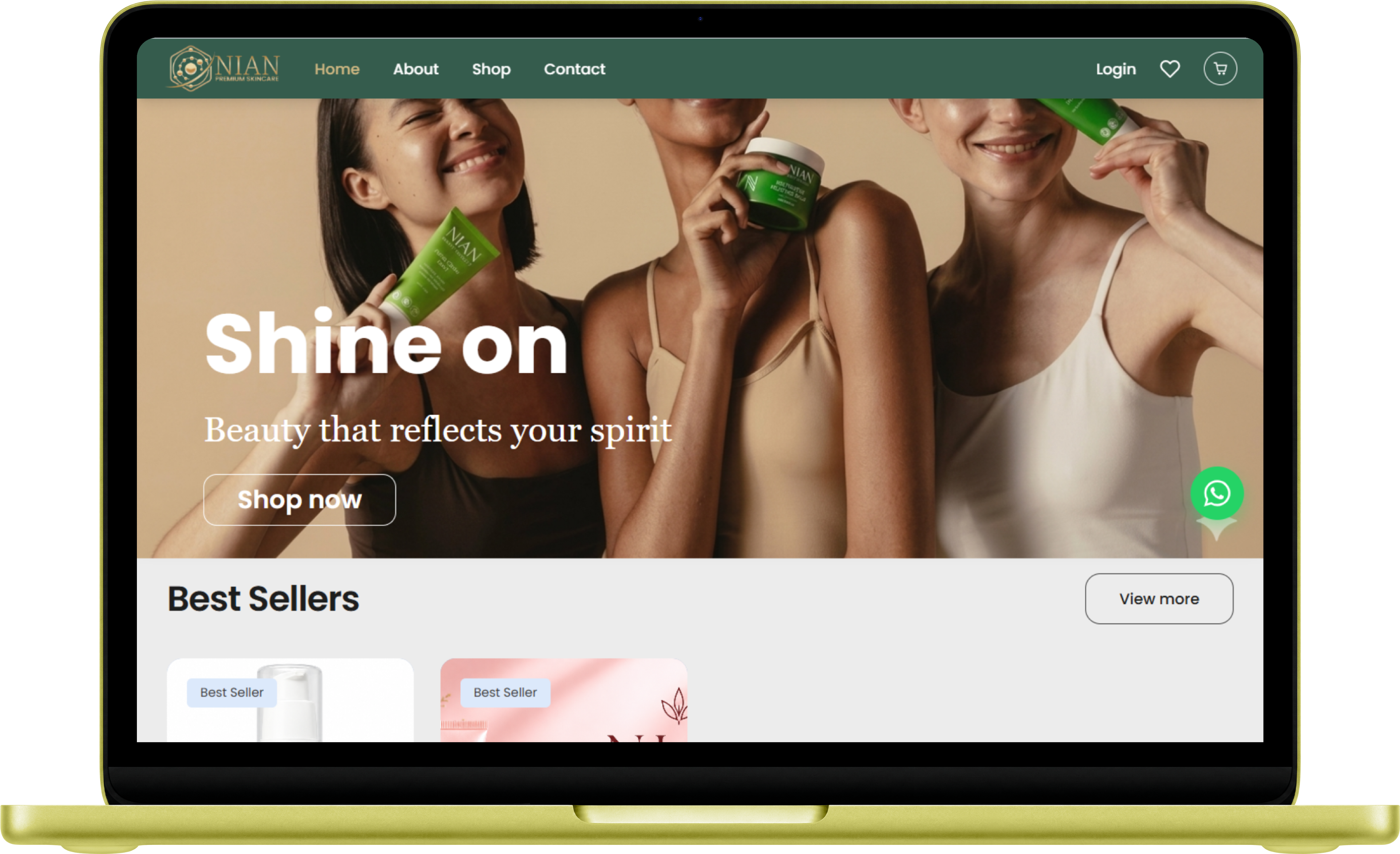
Nian Pharma didn't just need a new website. They needed one that could actually sell, and sell in a way that matched the quality behind the formulas. So we built the storefront with that in mind. A big, confident hero section up top, a product grid that doesn't overwhelm, and a path from "just looking" to checkout that doesn't make people think twice. The catalog had to read clean too, since these are pharmaceutical-grade products, not just another skincare line, and that had to come through without burying it in text.
Key Features:
- A hero section and layout built to grab attention first, then guide people straight into the Best Sellers.
- Wishlist and cart tools baked in, so browsing turns into buying without extra steps in the way.
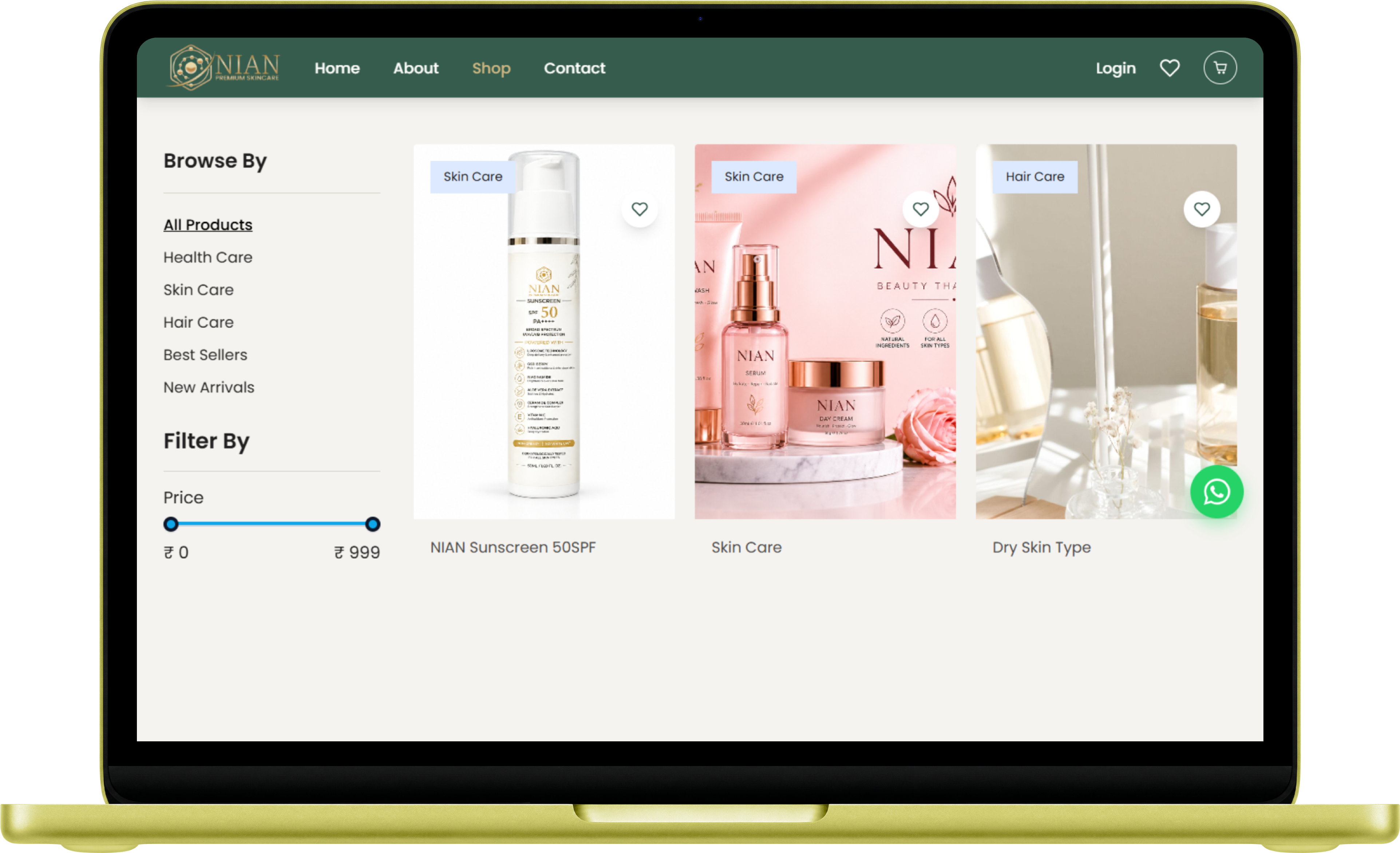
- A product catalog that lays out formulations and ingredients plainly, so trust builds on its own.
- A site that holds up on a phone screen just as well as a laptop, because that's where most people actually shop.

How we build the E-Commerce development Process
Kushel Digi committed to transform your tech solutions into impactful brands by ensuring unique customer experiences at every digital touchpoint through our structured process.
Discovery Phase
UX/UI Design
Web Development
Testing Automation
Product-to-market launch

01/ Discovery Phase
This phase is the foundation of a successful project. We focus on having a deep understanding about your business, target audience and goals to ensure that our solutions align with your business goal.
- In-depth Market Research
- Requirement Analysis
- Strategic Planning for effective execution

02/ UX/UI Design
We believe in user-centric design principles and to achieve this we design engaging and user friendly interfaces that align with your brand's identity.
- User Journey Mapping
- Brand Identity Integration
- Responsive Design

03/ Web development
Our development team is always committed to bringing your vision to life by integrating the latest technologies and best practices to build a scalable eCommerce platform.
- Customized Solutions
- Optimized Code
- Agile Approach

04/ Testing Automation
We thoroughly test every feature on the platform, using automation to deliver reliability, security, and an error-free experience before the user's eyes in front of its launch.
- Comprehensive Testing
- Automated Quality Assurance
- User Acceptance Testing

05/ Product-to-market launch
In this final phase of development, we introduce your platform to the market and ensure a smooth and impactful launch that maximizes visibility and customer engagement.
- Go-to-Market Strategy
- Performance Monitoring
- Ongoing Support
Result & Impact
The new site gives shoppers what they actually came for: a clear look at the products, the categories, and everything else without the runaround.
- Pages load faster now, and that alone changed things. Visitors stick around longer instead of bouncing off a slow product page.
- Navigation stopped being a puzzle. Skin Care, Hair Care, Best Sellers- all of it sits right where you'd expect, so people find what they want and actually convert.
- Product pages got cleaner, checkout got shorter, and sales followed. Less friction between "I like this" and "I bought this" tends to do that.


